Teaser blocks (custom and referenced)

Teaser modules are used in the sidebar to link to related or other relevant content in the teaser view:
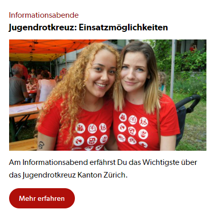
A distinction is made between two variants:
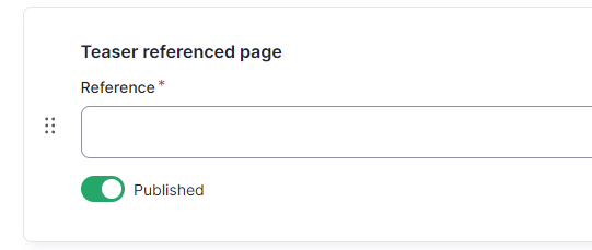
- Teaser referenced page: The teaser view of an already existing page is used. Here you can select the desired page directly using the selection field:
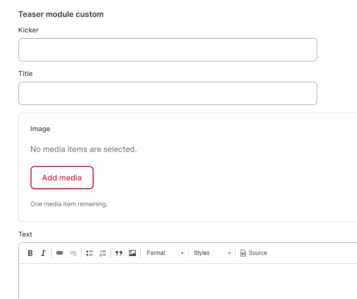
- Teaser module custom: The editor of the page can put together the teaser himself. The following fields can be filled out for this purpose.
- Kicker: Red title before the page title
- Title: Black title below the kicker
- Image: Image used below the title
- Text: Text below the image
- URL: Link to the red (or blue) button below the text. An external or an internal page (search via text field) can be specified here.
- Link text: Text of the red (or blue) button below the text
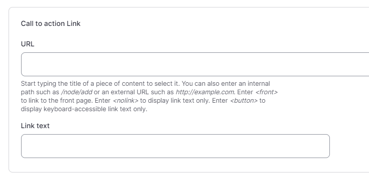
- Boxlink: Linking the entire section above the red (or blue) button. An external or an internal page (search via text field) can be specified here.
- Background Color: Setting for the background color that the teaser module should have.
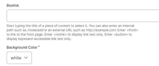
The default background color of the teaser module is white/white, i.e. without a background color.