Form fields (Build)

The individual fields that should appear in the form can be defined under the “Build” tab (e.g.: a text field for entering a name or an email field for entering an email address or a date field for entering a date of birth, etc.).
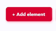
To create a new field, the red button + Add Element must be selected:
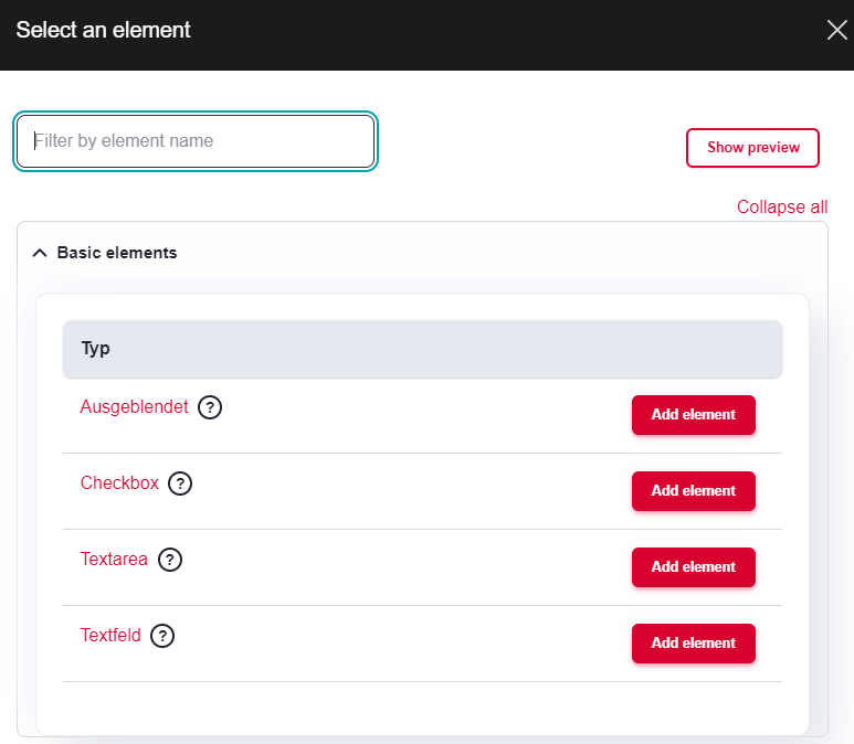
A window then opens with the possible field types:
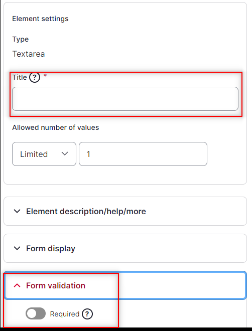
As soon as the field type (see below) has been selected, a window opens on the right where all further information (title of the field, required field, dependencies/conditions) can be set:
Field types
The following important field types (other field types are enabled, but are rarely if ever used) are available:
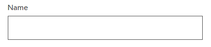
Text field
A simple text field. Often used for short text information (e.g. last name, first name, company, street, city, etc.)
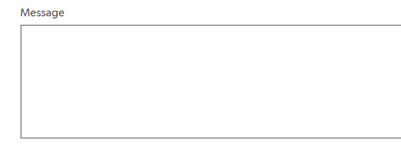
Text area
A larger text area (typically 3 lines high at the beginning. Often used for longer text information (message, feedback, etc.)
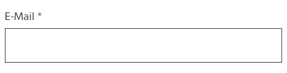
A text field for entering an email address (results in an error if not in the format example@test.domain)
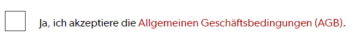
Checkbox
A single checkbox that can be activated or deactivated (e.g. for accepting the terms and conditions)
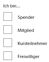
Checkboxes
A checkbox list with multiple choices
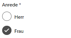
Radios
A radio button list where only one value can be selected
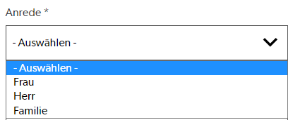
Select
A drop-down list with a selection options
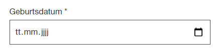
Date
A date field. Often used for a birthdate
Details
For grouping fields. The element can be expanded/collapsed.